So I have never been particularly shy about how one of the things that I love most about digital art is the ability to make changes.
Something in the wrong spot?
Change it.
Finding that a brush stroke didn’t quite turn out the way you want?
Change it.
Need to resize something?
Change it.
And one of the things that I REALLY enjoy doing is playing with color.
I love how an image can look completely different if you change the colors. New details emerge. You can shift from one time of day to another with a few changes. Warm hues evoke sunny days and cooler shades the calm of night.
It allows me to try different looks for a single art piece before settling on one that I like.
To do this, I use several strategies depending on the piece:
1. ColorDrop – this works well if I want to change the color of an entire layer or large space. I can select the new color and simply drag it to the area I want to cover.
2. AlphaLock and Brush – this strategy works better when I only want to change the color of specific details or I want to change the look of an area slightly (note: you can do this without AlphaLock if you are okay with adding new lines).
3. Create a new Layer – I don’t use this as often, but sometimes if I am having a tough time with finding the right colors for the sky, I might unselect the layer I have and try again with a different color palette.
Here is a recent example:
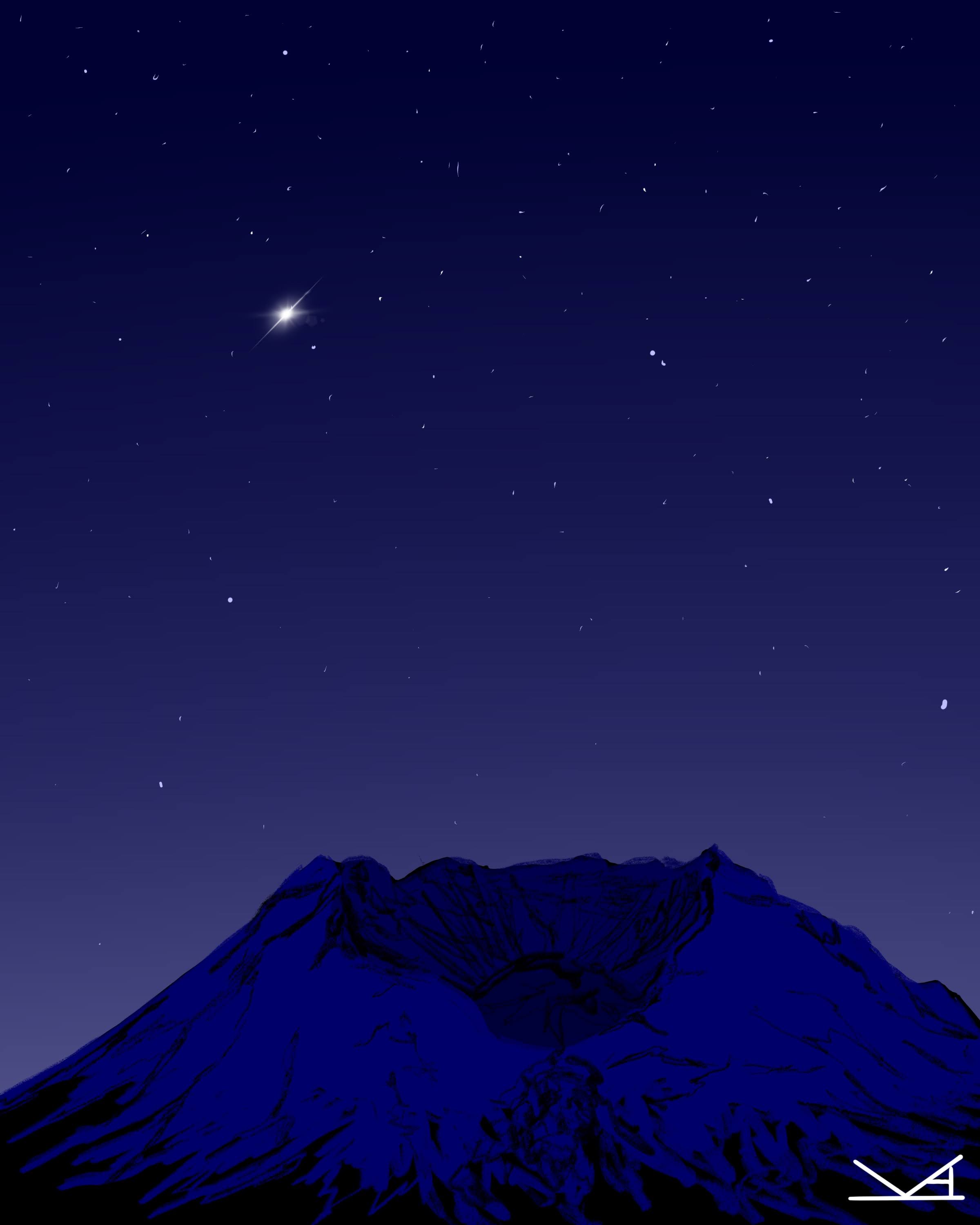
On a rainy weekend recently, I decided to draw a series of sketches of nearby mountains: Mt. Hood, Mt. St. Helens, and Mt. Rainier. I had a general sense of the look I wanted (admittedly I ended up lightening the blue shades on Mt. Hood), but spent several hours playing with color families.


I was pretty happy with the results of such a quick sketch session.
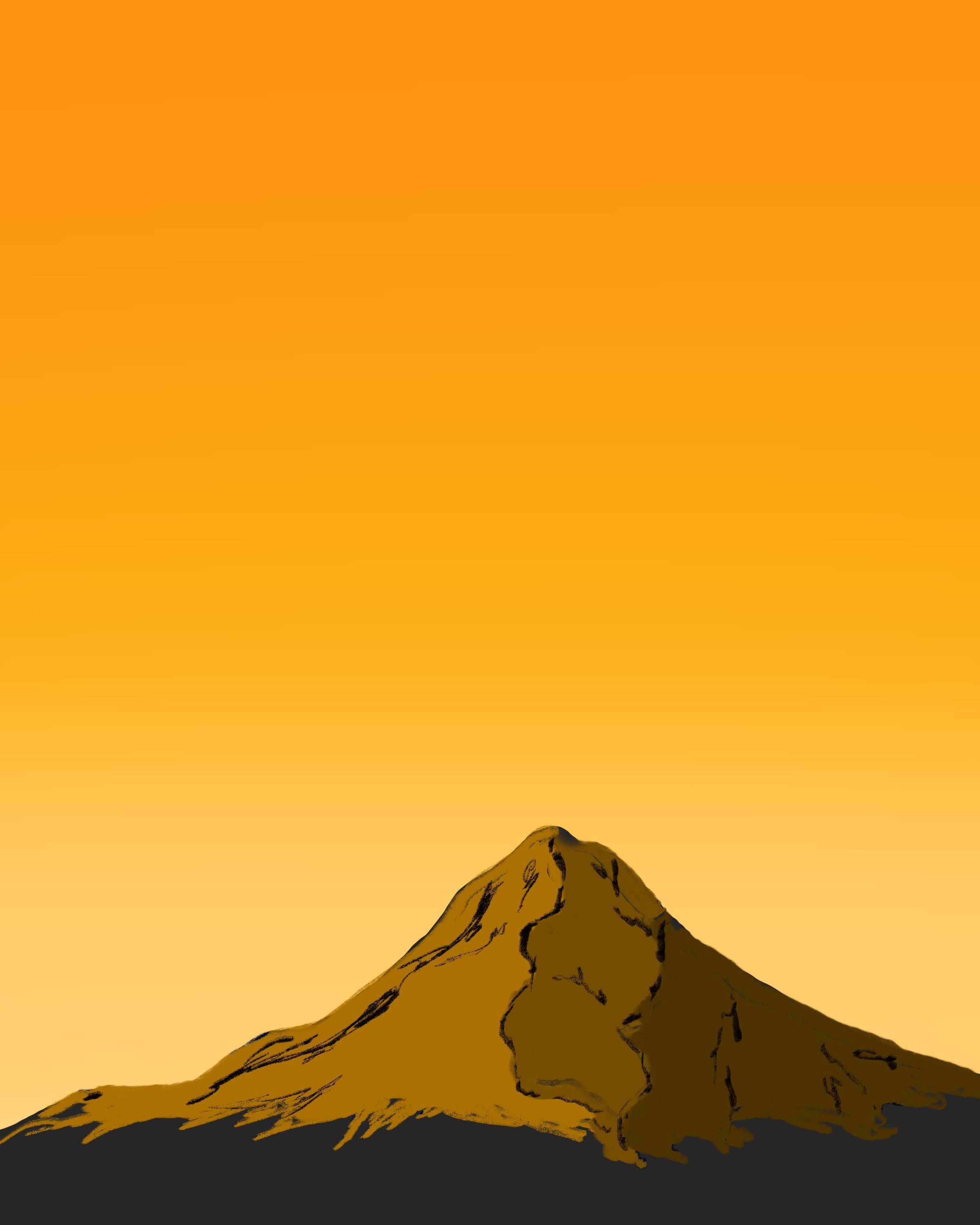
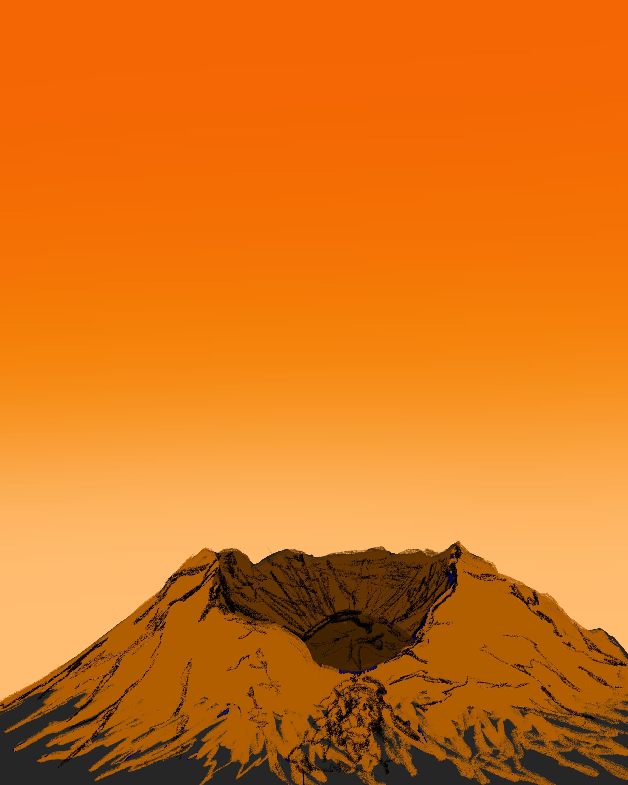
But several days later, I found myself curious about how the images would look if they were a bit brighter. So using the methods mentioned above, I recolored them. The results were quite different:


Very different art.
Details that had been lost in the darker images suddenly emerged, especially with the subtler shading. I did decide to stick with the idea of a gradient though, trading blue to violet for gold to red hues.
The point is: digital art allows you the freedom as an artist to try something and if it doesn’t work, try again without starting over. So if you draw something in a particular color that doesn’t seem quite right…Change it.