Start with a sketch

So the first thing I want to say is that every artist has their own process that works for them. The medium and style that suits their work. And that is one of the beautiful things about art – the ability to create something that matches our personal taste.

And admittedly, I’m still very much trying to find my stride with my art. I wouldn’t say I have a specific style beyond nature-themed art (originally I focused on the Pacific Northwest, but have started trying to broaden my work a bit). And one area I have tried exploring more is art with an animal focus.

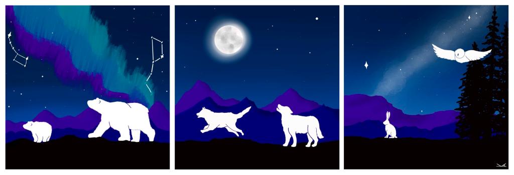
So my first forays were entirely silhouette. Learning about the general shapes that these animals follow. It also gave me a chance to study lots of reference photos to learn more about the curves of various animals and where there legs are as they move in certain ways.

Arctic Triptych

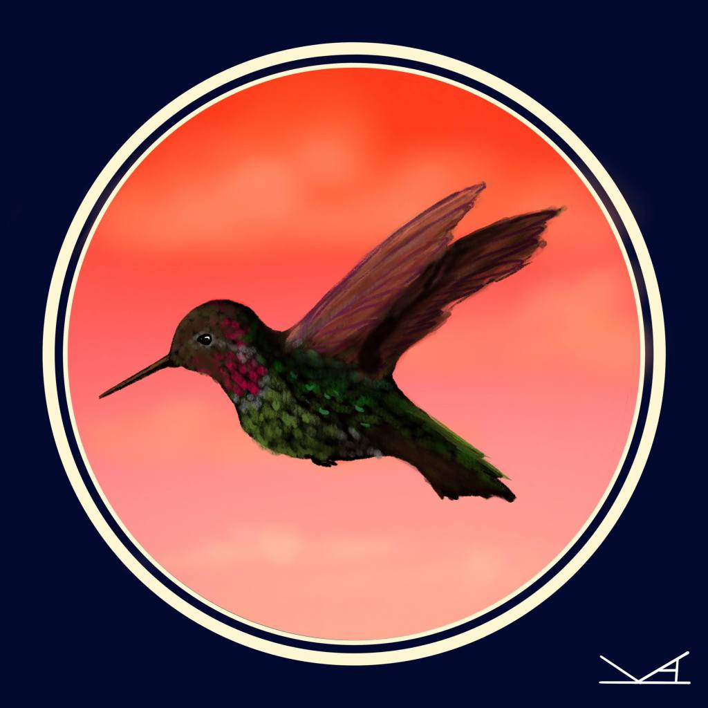
Then I started using these silhouettes to add details on top. Starting with adding feathers to birds. I also had been seeing quite a few Anna’s hummingbirds on walks near my house, so I had to give them a try. (Note – I would really love to try drawing these again in the future as I continue to practice)

Male Anna’s hummingbird in flight

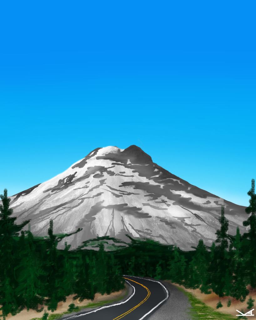
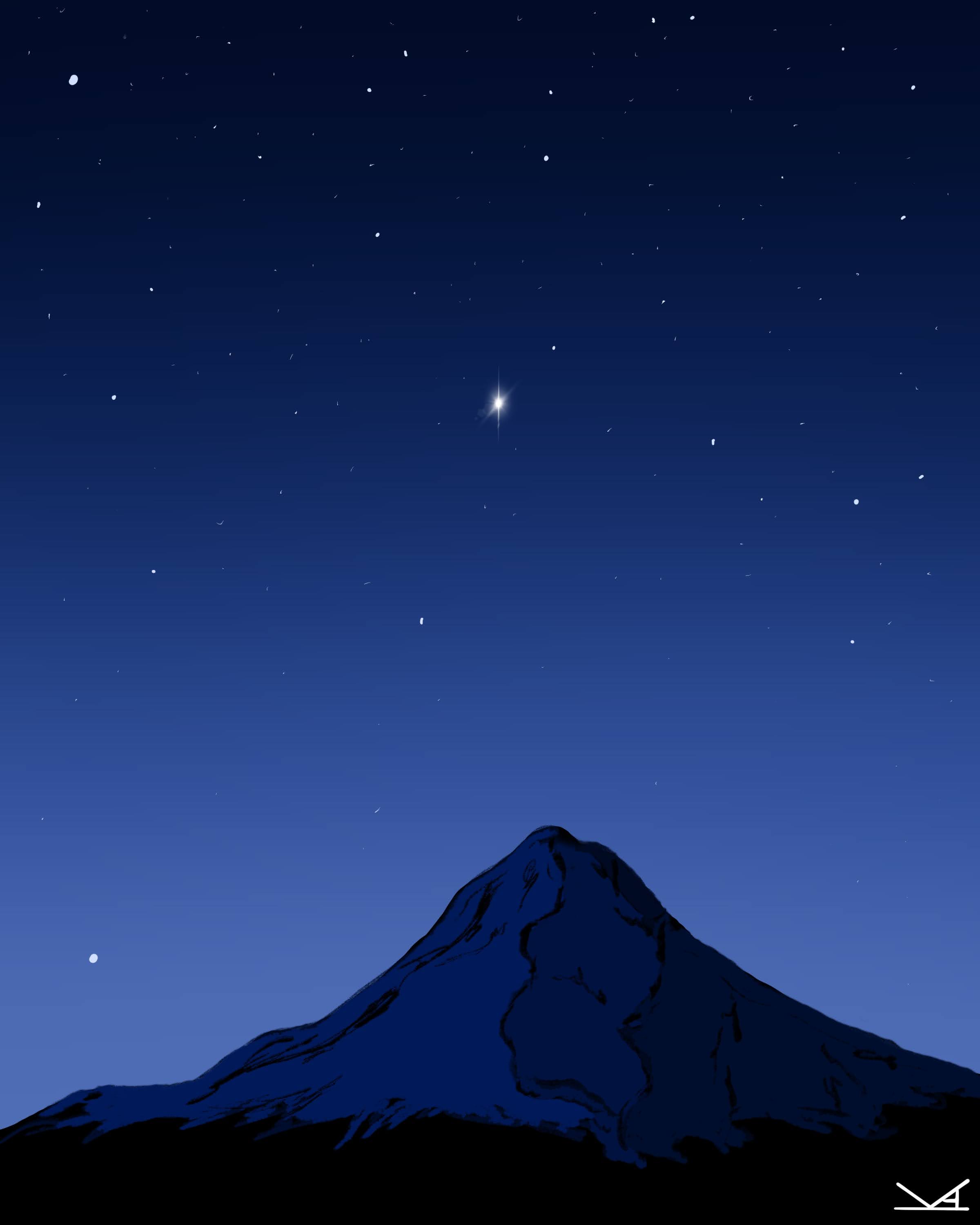
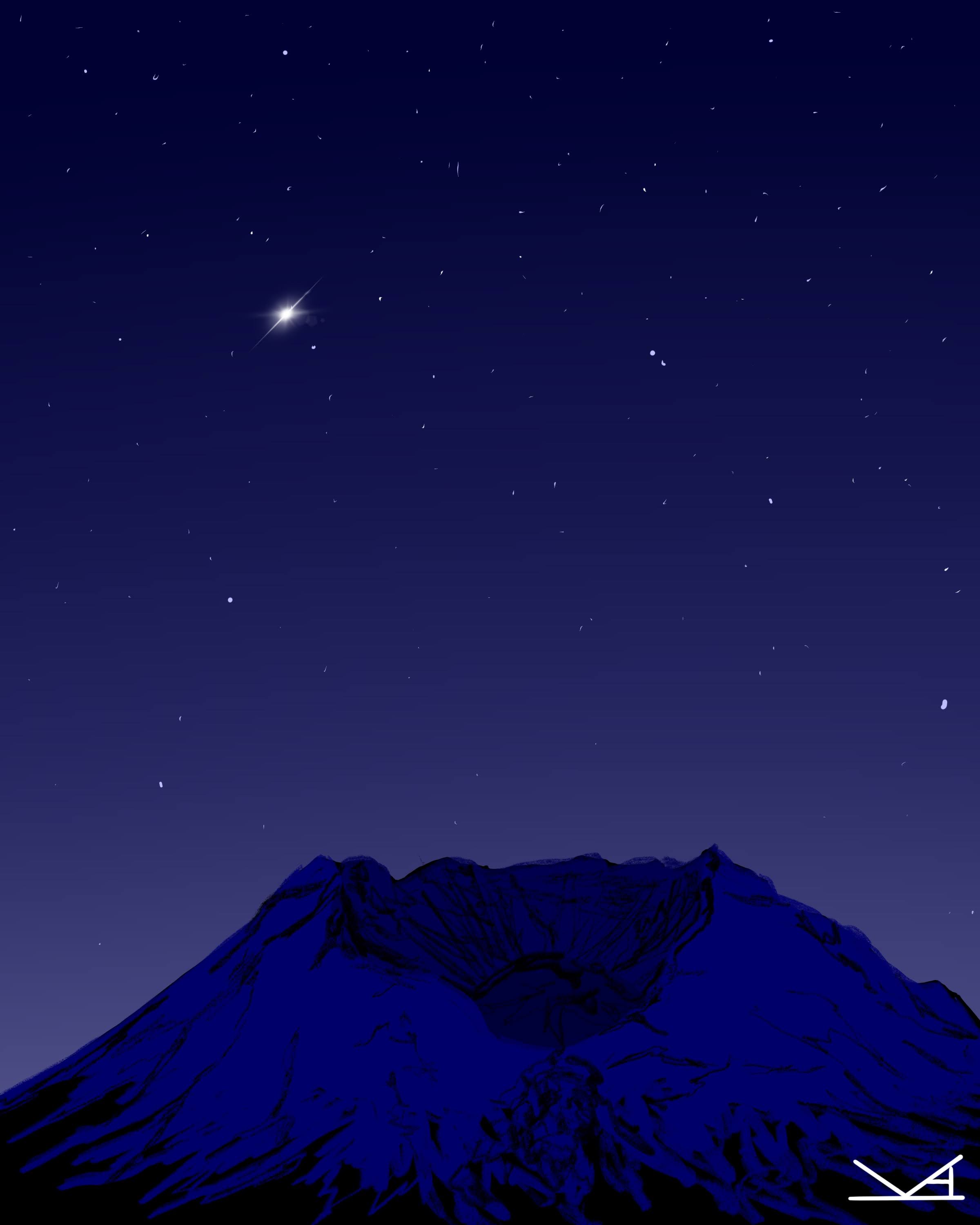
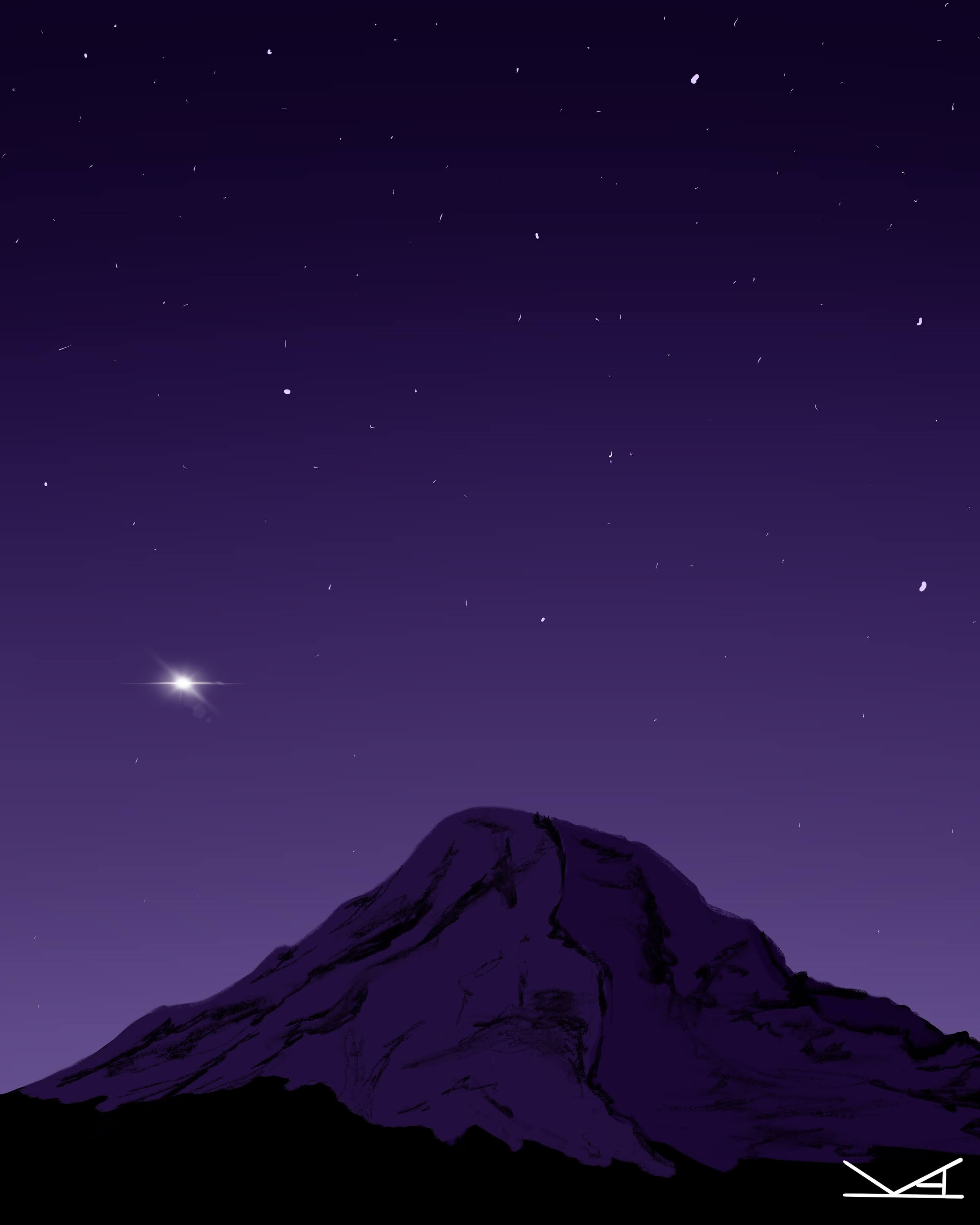
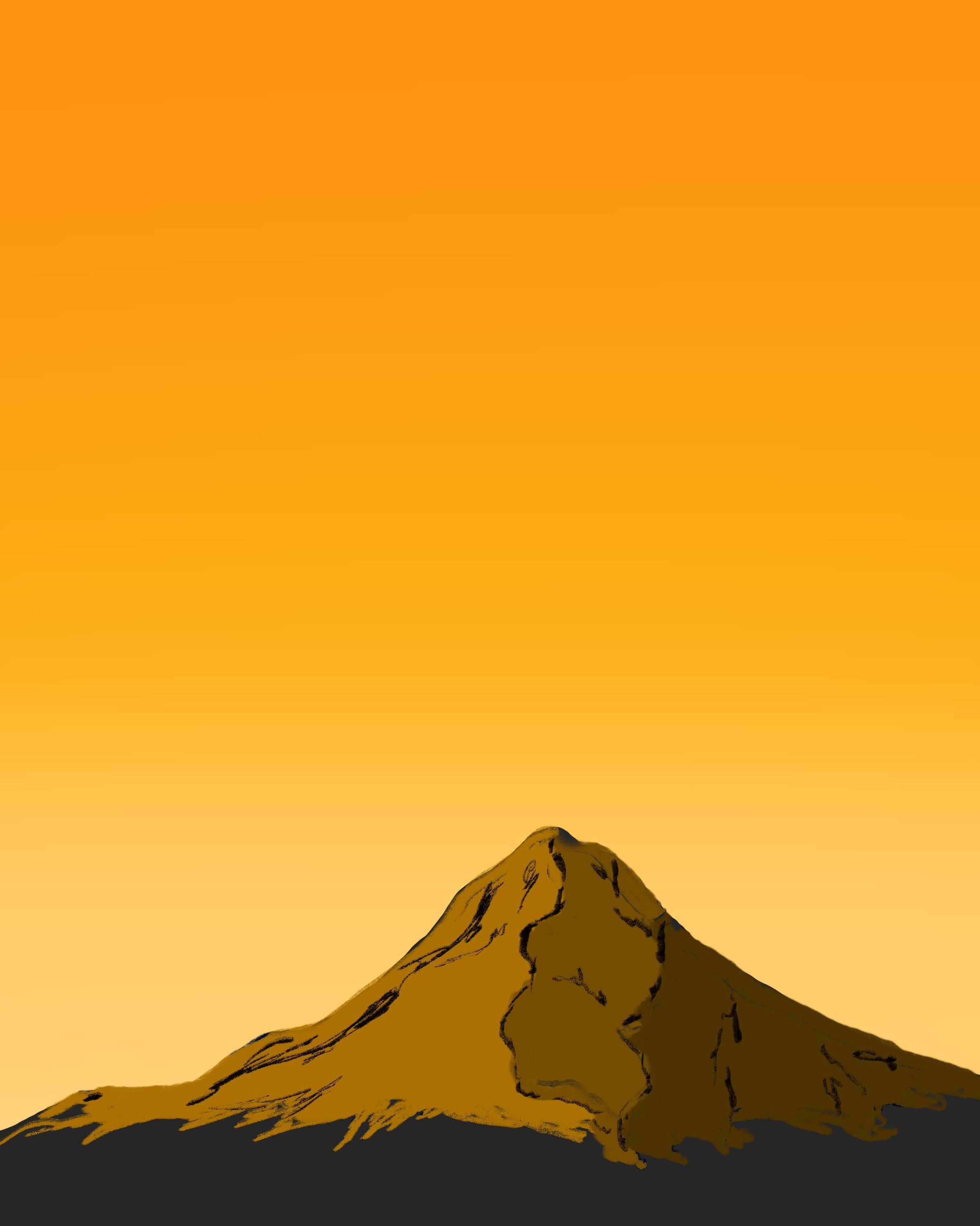
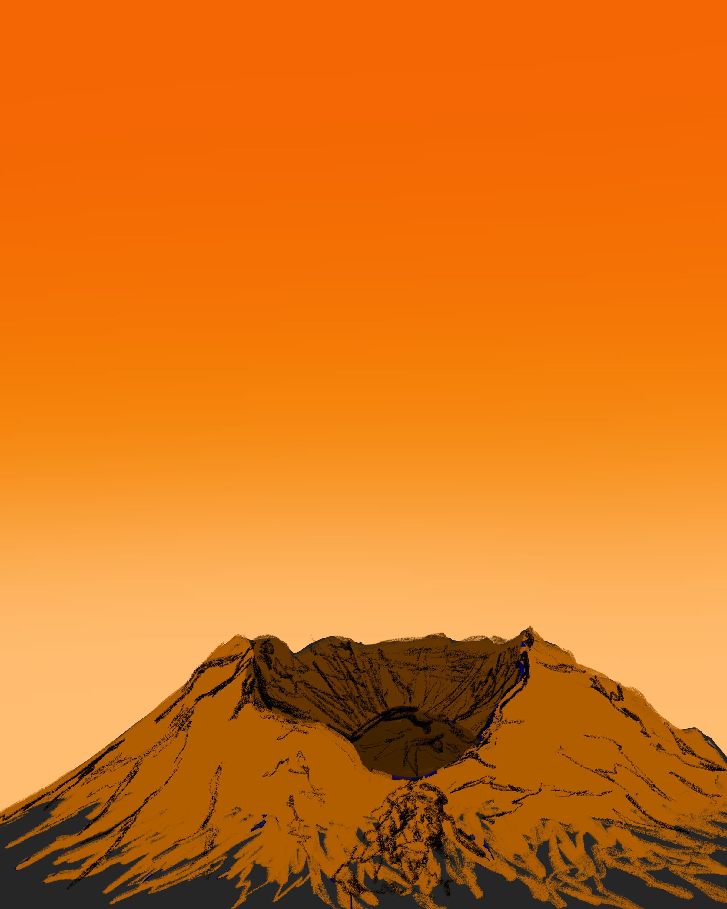
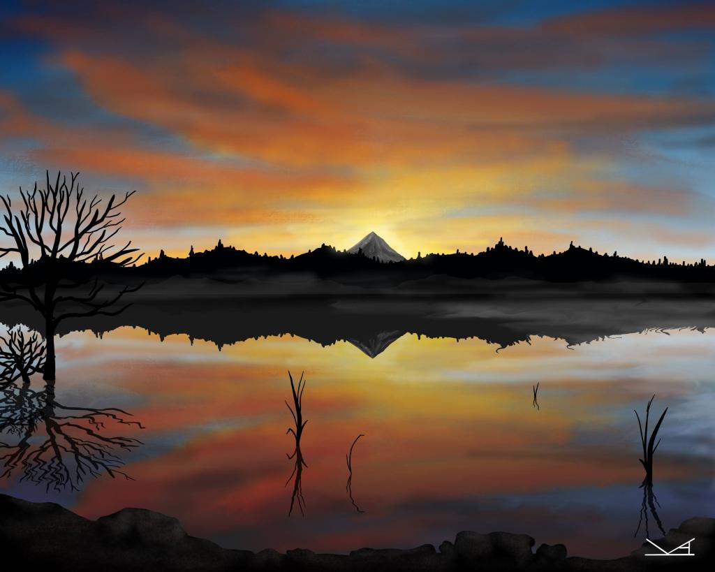
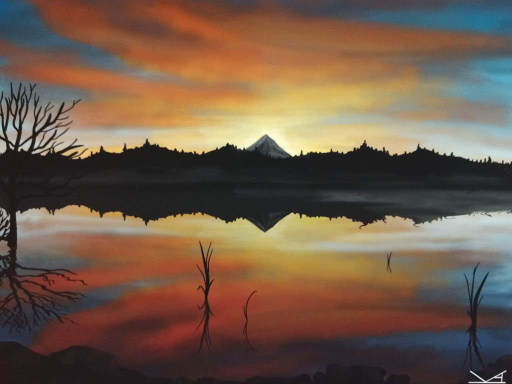
After this I found myself returning back to the comfort of a familiar design, namely the mountains of the Cascades. I created a number of designs and was starting to play a lot more with clipping masks. The ability to try things out without affecting other layers and help with “coloring inside the lines” was very helpful.

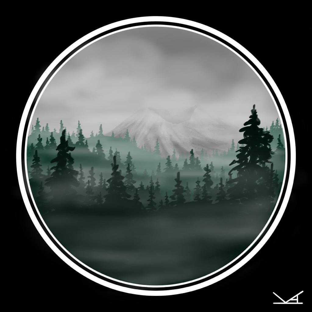
Eventually, I decided to try clipping a mountain scene to an animal outline. To create these, I would design the background scene and the inset scene, then clip it to the animal silhouette. I still haven’t decided if I liked having separate scenes between the background and inset or simply varying the colors. But in the process, I started adding more details again to the form of the animals I chose.

And then one of my friends challenged me to draw a specific animal. One that I hadn’t dared try yet – a sea turtle. I wasn’t sure where to even begin. So I spent several hours browsing for reference images. But instead of diving in and freestyling, I decided to start with a sketch.

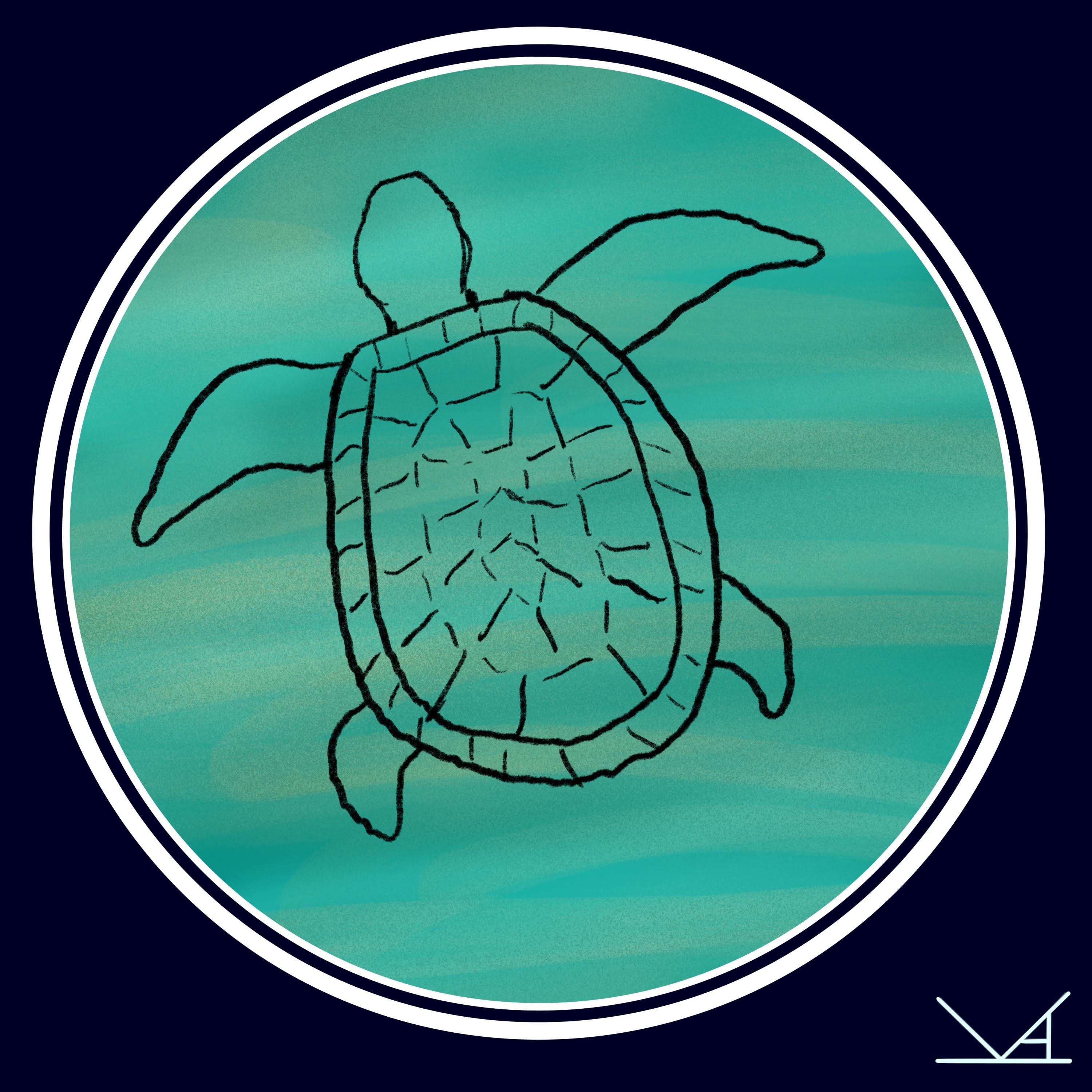
As I added layers, I made a number of changes to the design, but found it helpful to have a starting point. I have used this technique for the last few drawings, with some resembling my earlier silhouette outlines and others being more detailed. It especially helps when I have needed to step away from a piece for a bit to have an idea of where I was going with the design.

Regardless of the process, one thing I have learned is that a sketch can be great place to start.

Getting Out(side)

Being outside is where I am happiest.

I am fortunate to live in an area with lots of green spaces (some only a few minutes from my house). And in the past, I would get out in them on a weekly basis or maybe more often, especially in the warm summer months.

And these natural spaces often serve as the starting point for a lot of my artwork, which features the landscapes, plants, and animals of the Pacific Northwest heavily. These areas also are great for clearing my mind when it feels busy or cluttered.

But this past year, I have spent far more time indoors than I normally would.

And as summer approached, I was missing the outdoors and honestly feeling stuck in my art as well. Ideas were not flowing as freely as they had been.

So as I knew I had some time off, I decided to get outside again. This time, trading my deep green and gold forests for the land near Bend/Sisters, with its landscape visibly shaped by the volcanoes and lava flows throughout the area (and its air heavy with the butterscotch sweetness of Ponderosa pines).

I was lucky to find a campground with a vacancy for the few days I was off and that would make a great base camp. Maybe a little adventure was just what I needed to clear my head and find my inspiration again.

So with a fully packed car, I headed southeast, leaving the I-5 corridor for the forests of the Cascades. It was much cooler as I wound my way through the mountains, glimpsing peaks between the clouds. Watching as the color palette shifted and the land opened up wider beneath the sky.

On my way to the campsite, I stopped briefly at the Headwaters of the Metolius to stretch my legs. It’s a short hike from the parking lot to the area above where the springs bubble up from the shaded ground and widen into a river. And there are ground squirrels. EVERYWHERE.

These ones were especially inquisitive and would nearly run up to the toes of my boots. Butterflies also flitted in and out of the trees. But I also wanted to make sure I was set up before nightfall (which is thankfully late in the evening in summer).

The next day, I headed for the Cascades Lakes Scenic Byway. This road wends itself between the Three Sisters and Mt. Bachelor and is stunning. Honestly, I could have just spent my whole trip exploring this area. The Sparks Lake area was particularly beautiful, with an amazing view of Mt. Bachelor (and I hope to add some drawings of it soon).

I also visited Newberry Crater while I was down there. And learned that there are lizards among the lava flow! I was lucky enough to overhear a tour group on my hike and later found a couple brown lizards skittering across my path, seeking shade from the already hot sun.

One surprise was Shevlin Park, which my explorations of on two days were cut short by passing thunderstorms. But I would 100% go back. Especially because there are so many cool birds. I saw a woodpecker and heard rumors that there are owls. Which is absolutely an excuse to come back and explore some more.

On a side note, I also found some amazing food. Angeline’s Bakery in Sisters had amazing vegan and gluten-free baked goods. Including large cinnamon rolls that made for not only a delicious breakfast, but a filling afternoon snack as well, along with easy options for lunch. Bend Pizza Kitchen was also incredible with vegan pizza (I recommend the Prima Patata), which along with a vegan Caesar salad and some garlic knots, I was able to enjoy for lunch the next day.

But most importantly, I felt relaxed again. At ease. I traded my iPad for pencil and paper and snapped photos of the things around me.

And once I returned home, drawing again had a flow to it. And I was able to use what I seen as a starting place for designs.

Since I returned from my short trip, I have been making a point of getting out in the green spaces near my home again too. Because what better way to be inspired by nature than being out in it.

I guess sometimes what I need is to:

get out of my house,

get out of my head,

and get outside instead.

Unexpected Inspiration

So I have been feeling a little bit stuck with my art. Admittedly, my brain has been rather full of other things, but my art has often been a refuge in those moments. Like a good book, it is something that I could curl up with and lose myself for a few hours after work.

But for several days, I couldn’t come up with any ideas. So rather than push it, I took a break. I finished reading a book (Siege and Storm, the second in the Shadow and Bone trilogy) and picked up a new video game (the New Pokemon Snap is surprisingly fun).

Then as I was at work, an idea started to form. I ignored it for a day (admittedly I was really into Pokemon Snap). But it just would not disappear.

Dark teal green trees, enveloped in mist.

So rather than just let the design simmer, I decided to give it a go. I also decided to try a new brush – the Streaks brush under Calligraphy in Procreate- to create the trees. I feel like I still haven’t found the right brush for conifer trees – or deciduous ones for that matter. I feel like the more I play, the closer I get though.

So I started with a plain grey sky to make the trees pop. Then I had to find a color palette that matched my vision. Admittedly the one I landed on was more green than the dark teal I had imagined. I actually tried changing it to a more teal scheme part way through, but didn’t like it as much.

Then I had to add the mists. I used the soft brush at about 40% opacity in different shades of light grey, varying the brush size to create a wispy effect. This is similar to how I create clouds, though again I am sure I will continue to learn better ways to create the look I want.

But when I finished my original idea, it felt incomplete. I added a few wispy clouds and darkened part of the sky, but it was still missing something. And given my recent designs, I decided to add – a mountain (surprising, I know…HA).

Initially I started with a design that looked a bit like Mt. Rainier, but as I kept at it, couldn’t quite get it the way I wanted it. So I unselected the layer and chose to try a different look, creating a multilayered Mt. St. Helens. But once again, it wasn’t quite right.

So I toggled between the two mountains, played with the opacity of the layers, and tried adding more clouds. As I fiddled with the settings, I noticed that the two mountains were intriguing when layered and the opacity of one turned lower (about 85%). So instead of creating a third mountain, I blended the layers and erased part of the mountain that had ended up on top.

Much like inspiration…

Sometimes, we find what we’re looking for in an unexpected place.

Color Outside (or Inside) The Lines

So I have never been particularly shy about how one of the things that I love most about digital art is the ability to make changes.

Something in the wrong spot?
Change it.

Finding that a brush stroke didn’t quite turn out the way you want?
Change it.

Need to resize something?
Change it.

And one of the things that I REALLY enjoy doing is playing with color.

I love how an image can look completely different if you change the colors. New details emerge. You can shift from one time of day to another with a few changes. Warm hues evoke sunny days and cooler shades the calm of night.

It allows me to try different looks for a single art piece before settling on one that I like.

To do this, I use several strategies depending on the piece:
1. ColorDrop – this works well if I want to change the color of an entire layer or large space. I can select the new color and simply drag it to the area I want to cover.

2. AlphaLock and Brush – this strategy works better when I only want to change the color of specific details or I want to change the look of an area slightly (note: you can do this without AlphaLock if you are okay with adding new lines).

3. Create a new Layer – I don’t use this as often, but sometimes if I am having a tough time with finding the right colors for the sky, I might unselect the layer I have and try again with a different color palette.

Here is a recent example:
On a rainy weekend recently, I decided to draw a series of sketches of nearby mountains: Mt. Hood, Mt. St. Helens, and Mt. Rainier. I had a general sense of the look I wanted (admittedly I ended up lightening the blue shades on Mt. Hood), but spent several hours playing with color families.

I was pretty happy with the results of such a quick sketch session.

But several days later, I found myself curious about how the images would look if they were a bit brighter. So using the methods mentioned above, I recolored them. The results were quite different:

Very different art.

Details that had been lost in the darker images suddenly emerged, especially with the subtler shading. I did decide to stick with the idea of a gradient though, trading blue to violet for gold to red hues.

The point is: digital art allows you the freedom as an artist to try something and if it doesn’t work, try again without starting over. So if you draw something in a particular color that doesn’t seem quite right…Change it.

Happy Dance Time

Today has been an exciting day.

After work, I was able to go and pick up some prints that I had ordered of a couple designs. I had sent some prints to be done locally at a couple different places, but hadn’t quite been happy with the results. I had purposefully chosen a design that had some subtleties in the shadows and colors.

Here is the original digital file

With such a color rich print, I knew my home printer was not an option (it is prone to streaks of color). I also wanted to see what the print looked like with a matte finish as many of previous prints had been glossy.

I barely made it back to my car before tearing the package open and inside there were two prints, including the one above.

Here is the print:

Needless to say I am super excited! Now I just have to decide where to hang them. Decisions, decisions…

In other news, I sold my first batch of stickers. All twelve of them. Which of course means I will have to order more.

Which leads me to the other exciting news of the day…

I’m getting ready to launch an online business!!!

Though I am still not a 100% certain which platform(s) I will use, I will finally have some products soon that I am ready to start posting. More details in a future post once things go live.

But for now, time to grab some dinner and maybe squeeze in some doodle time. And of course do a little happy dance along the way.

Progress Over Perfection

Ok. Confession time: I am a recovering perfectionist.

What I mean is, I am very much still in the process of learning that even though something may not turn out exactly the way I originally envisioned, that does not mean that it is somehow not worthwhile.

Admittedly, very few of the pieces that I draw actually turn out the way I planned them. And that probably isn’t a bad thing. Sometimes it might be that a color combination I had in mind didn’t quite look how I imagined. Other times it might be that the brush I thought would give me the effect I was looking for didn’t work the way I thought. Or to be honest, it might just be that I haven’t learned the technique I need to make something possible quite yet.

And all of those are okay.

In fact, one thing I love about posting my artwork is being able to track the changes over time. A constantly changing portfolio of learning and growth. From new shading techniques to using layers/settings in a different way. Or even learning about some feature that was available in the app all along, I just didn’t know it yet.

One of my favorites so far has been my work with planets and space art.

I love space. I love learning about Earth of course, but there is something almost magical about the wider universe. I have followed NASA on social media for years and will watch any livestream I can. I also love finding opportunities to talk with others about it. So unsurprisingly, some of my favorite designs capture these other worlds in some way. Which leads me to a few specific examples.

Example 1: (Jan. 2019)

This is the very first thing I drew on my iPad Pro using Procreate (honestly one of the best things I’ve ever spent money on). I had used the app before on a work device, but hadn’t done much digital art in years. And honestly I had created nicer things in a high school computer graphics class. But I am trying out so many new brushes and techniques. I was learning to play with the design. And recognizing that even if it doesn’t look like I want yet, there is a lot of potential to learn something new.

Example 2: (Early Mar. 2021)

Two years (and LOTS of practice) later, I have a clearer sense of how to do certain effects. Youtube and Google are resources that can be really helpful when trying to learn how to do something. Like how to use liquify in a way that looked more like what I had originally intended. There are also many more layers, including the planet itself. Studying lots of reference photos taken my spacecraft, I started getting a sense of how a planet would appear shaded. About perspective. But there is still more to learn.

Example 3: (Late March 2021)

During March 2021, I decided to challenge myself to draw every day. Some days I had more energy and brain space than others, but I found that I was much more willing to try new things. I had played a lot more with liquify. And layer masks to allow the rings to curve correctly. Light glowing and sparkling in different spots and at different levels.

Like many things, practice helps us grow and learn. Sometimes we find ourselves challenged. Other times we might run into a lack of new inspiration (I draw a certain mountain quite a bit since it is easy for me to see in different light throughout the day and year). There are new areas to progress in. And it is okay if it’s not what I hope yet because I know every doodle gets me a little bit closer to capturing the drawings I imagine. And sometimes I end up learning something new I never expected along the way.

Welcome to the Fernheart blog!

Hello and welcome!

This is the first of what I hope to be many blog posts about my creative journey.

First, a little introduction.

  1. I did not see myself as an artist until recently. – Admittedly, until the last couple years, I would have been the kind of person who said “I can’t draw”. There were a lot of stick figures and a lot of abandoned sketchbooks. I tend not to work quickly, or rather I don’t like to share things typically until I am 100% happy with them. Learning to let go of that habit.
  2. Art is not my current job. – I do not create my art full time. It is my way of relaxing after work or on the weekends. Occasionally one of my artworks find their way into my job though.
  3. I started getting more comfortable with digital art after learning about sketchnoting. – Ok, slight tangent here, but if you have ever loved to doodle in the margins of pages while listening to information, I highly recommend looking into sketchnoting. Using icons to represent ideas not only helps build connections, but I think it makes the information much easier to remember and is more fun than other note-taking strategies. Also practicing drawing icons or different shapes is what started helping me become more comfortable with art.
  4. I currently draw my art on Procreate using an iPad Pro and Apple Pencil. – Of things for myself that I have spent money on (besides travel), this has been my favorite. I take it EVERYWHERE I can – to the coffee shop, on trips, or just sitting on the couch or at my desk. I like the control that the Apple pencil gives me when creating details, along with the ability to try things in layers. This was a game changer for my confidence in art. If I don’t like it, I can delete it. And honestly, I’m much more confident drawing using traditional pen and paper now too. I’ve had a couple of sketch journals on trips over the past few years.
  5. I love learning new things. – This might be one of the big reasons that I like drawing. It challenges me to see the world in new ways and to think about how to best capture it. There are so many perspectives of the same location that can create a completely different design.
  6. I love to be outdoors. – SHOCKING, I know. But it is true. I am at my happiest when I have had a chance to go and walk in the woods. I love seeing all of the different shades of green, watching the sunlight play across the ground, hearing the bird song… I’ve even learned to love the rain. Plus petrichor is one of my favorite words.

That is all for today.